Sunday, 29 January 2012
Clean Cut Image
I have now decided that I want a clean cut theme. With my model seducing the audience in an alternative manner, instead of wearing seductive clothes.
Thursday, 26 January 2012
A Change In Idea Of What I May Call My Magazine
I may now call my magazine 'PopStream', this is because I thought of iconic products that defined the 1980's as this is what my magazine is based upon. I therefore got the idea of incorporating the idea of 'SodaStream' into the magazine. I then thought of the word 'pop' which defines the genre of music that I am loosely basing the magazine upon. I then combined them together to make the word 'PopStream'.
Equation
'Pop Music' + 'SodaStream' = 'PopStream'.
Equation
'Pop Music' + 'SodaStream' = 'PopStream'.
Monday, 23 January 2012
Sunday, 22 January 2012
My Target Audience
My target audience will be people that love '80's' pop music. The magazine should appeal to both males & females as it will feature varied colours & it will use models of both sexes. The audience should be into 'mainstream' fashion from the 1980's. This consists of a lot of denim (especially jackets & jeans), along with knitted jumpers, sports trainers & outgoing hairstyles based on George Michael's hair. Therefore they will have to be interested in fashion. Although the magazine will be featured around the 80's it will also feature artists that are similar to that type of music now, therefore artists from the latest generation will also be included, meaning that this may appeal to others as well. The magazine will also have a hint of modern fashion in it as well, it will be 80's fashion combined with today's fashion.
Ideas For A Magazine Font
I like this font because it gives off a stereotypical retro feel to it. It reminds me of album covers made by the record label 'Motown' for some reason, which is vintage.
I like this font because it is bold & stands out well. It catches the audiences eye & also looks vintage, yet not too vintage therefore appealing to a wide audience.
I like this font because it is big & looks good. It isn't very bold, yet it is retro looking. Therefore fitting in with the theme of my magazine.
Ideas For A Magazine Name
As I will be wanting to produce a magazine targeting an audience that likes old music, in particular probably the 1980's. Therefore I have thought that 'Vintage', 'Time' or 'Record' are good ideas for a magazine name.
Saturday, 21 January 2012
3 Inspiration Music Magazine Covers
Freddie Mercury/Queen Rolling Stone Magazine Cover
I

This magazine uses the basic colour scheme of red, white & black. This is a very good colour scheme because it is one of the most appealing colour schemes that you can produce for a magazine that somebody is using. The layout works because it is all featured around the picture of Freddie Mercury live, this is a good picture to use because he is simply an icon in the music industry. The picture of Mercury is made to draw the readers attention. I can justify this because it is in the centre of the cover while being a bold confident picture which makes you look at it. The fact that his head is also over the traditional 'Rolling Stone' magazine logo shows that he is the main focus of this magazine. The masthead is also red, this creates a very bold & bright cover for the reader to see as they pick up the magazine. The background is black & features nothing except for Freddie Mercury which again backs up the fact that he is the main focus of this magazine along with his band Queen. The general font used on this cover is good because it gives the magazine a vintage feel to it which fits in with Mercury's era, it is also bold therefore the reader will look at the less important articles as well as the feature article. On this cover, another article is featuring Madonna, this is fairly clear because of the bold writing. Finally, the dates below the 'Rolling Stone' logo are important because this informs the reader of what the article will be featuring on, therefore it attracts fans of both Freddie Mercury & Queen because of the way that the magazine is presented. I like the simple basis of this cover because it is comes across to the reader very well therefore I would consider making my magazine cover like this.
Paramore NME Magazine Cover

This album cover is simply featured all around the band Paramore, in particular the lead singer Hayley Williams. The photo of the band on this cover is made to look quite basic & the band aren't dressed in anything over the top. This makes the band & the magazine appeal to people that aren't trying to find bands for just the look, this is for people that want to experience a band that can produce 'proper' music. Hayley Williams is featured in the centre of the cover & in front of the other band members because it is quite rare to see women in rock bands like this, therefore creating a whole new appeal to the reader of the magazine. The colour scheme for this magazine is quite complicated. It uses black, white, pink, grey & red as the main colours, however the trademark Hayley Williams orange hair could be classed as a major colour too because it could draw a reader to the cover of the magazine. The pink heading is very eye catching & it could draw a reader in to see what it says, then the smaller white text around it works well because it just contrasts the pink. The font is basic & it is obvious that the cover is trying to make you look at Hayley Williams, nothing else. The white circle used to promote an article with Mumford & Sons is also effective because this means that the magazine will appeal to a wide audience because of the different styles of music advertised on this cover. The circle also works very well because it stands out from the grey background used behind it & the font used for advertising the article to the reader is bold, using a good colour scheme of red & black. I like the sub-headings in the bottom left corner, this is because they don't draw too much attention to themselves yet if the reader looks at the cover in detail they may see more artists featured in the magazine that they like. This again shows how broad the music range is in this magazine.
Bob Marley Billboard Magazine Cover
This magazine cover featuring Bob Marley is very good in my opinion. This is because the whole cover is based around the feature article 'Is The Ghost Of Marley The Next Blockbuster Brand?', the picture itself gives off a very ghostly, haunting vibe. Therefore showing that this article is going to be aimed at his legacy after his death. This will appeal to both his old fans & the younger generation that like to find out about new artists. The picture of Bob Marley is used as the whole background in this magazine & uses washed out colours in the photo, giving the haunting vibe to the reader. The shirt that Marley is wearing also appeals because this kind of shirt is back in fashion therefore appealing to readers that like looking at various artists fashion senses. The shirt is also fairly basic which shows us that Marley was a very laid back man along with his hairstyle, which indicates a stereotypical reggae artist. This would therefore make this magazine appeal to an audience that likes reggae music. The masthead for this cover is very bright & bold, this catches the eye of the reader. The font for the masthead is also good because although it contrasts Bob Marley's work, it also shows the reader that the magazine will probably feature other types of artist other than Bob Marley & his trademark reggae music. The headings on this magazine are placed around Marley's face which shows that they are less important than the feature article, however they may be advertising articles that appeal to a different audience. The cover uses a very basic colour scheme, the main colour used is white which is used for all of the fonts used while the picture consists of a orange & a blue. Therefore creating an alternative colour scheme to the usual cover.
Thursday, 19 January 2012
Marilyn Monroe Picture
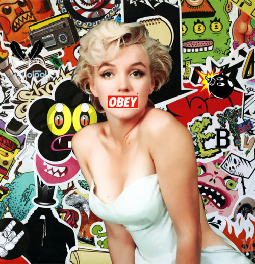
I really like this picture of Marilyn Monroe & I saw it on Tumblr. This is what I could possibly make my magazine look like, however I would like a more washed out feel to it.
Michael Kiwanuka's Album Cover

I really like this album cover because it has a washed out feel to it & I saw it earlier when I was playing it, this gave me some thoughts to what I could base my magazine cover on.
Wednesday, 18 January 2012
Double-Page Spreads

I like this double page spread because it is using a basic colour scheme. The spread is also showing quite an aggressive attitude by using the set pose that Lily Allen is using. The layout seems to be dedicated to making you look at Lily Allen's picture because the shirt is the only bright colour on the page generally while the picture is also large therefore showing that the article is featured on Lily Allen & trying to appeal it to Lily Allen fans or people that may like her style. I like the heading because it is alternative & it is presented casually to the reader. This is casual because the font is made to look like it is cut out newspaper letters, this also gives the sense of an aggressive approach because criminals may often send letters using this kind of style because they don't want to use their handwriting. This is also a clever font to use for the heading because she is in the newspapers often for various reasons so using a font that looks like a newspaper works well for the irony used in this article. The clothing that Lily Allen is wearing gives off a calm approach because she looks like she is just dressed for a casual day & her facial expressions give a sense of kindness which maybe gives the reader an insight into the Lily Allen that they haven't seen or heard of before this article has been released.
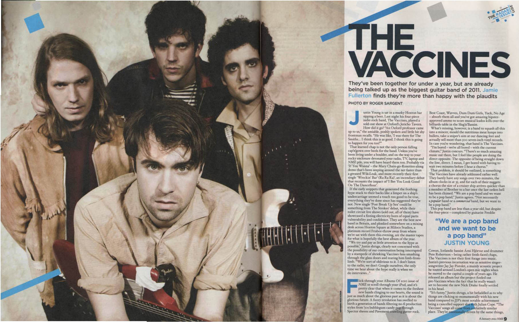
I really like this double-page spread because it has a vintage & dirty feel to it while also looking modern & up to date with technology. I like the picture on this magazine because it has a washed out, old feel to it that makes the band come across as being basic & here for the music, not for the fame in comparison for people like Lily Allen above. The Vaccines are wearing a fairly modern style of clothing, I think that this method works well as it contrasts the dirty, old feel to the magazine design. The heading on this spread suits the picture very well because it is very basic which gives it a simple, vintage feel therefore making the reader look at the picture to judge the bands looks. The bands photo looks serious which also brings us back to the subject of them being serious about their music & they aren't trying to make a major name in the media for themselves other than their musical ability. The photo also gives the reader a good insight into what the band will probably sound like if they haven't heard of the band before. They look like a stereotypical 'indie' band therefore maybe appealing to the audience that likes 'indie' music. The guitars also hint that they have a hint of rock in their musical influences therefore appealing to people that may like rock music as well. I like the hints of blue in the colour scheme as well because it gives it a slightly modern feel which reminds the reader that this is a new, up & coming band, maybe a good band to follow for the future. The blue lines on this magazine also match the blue quote in the text which creates a certain colour scheme. The lines also make the magazine look like it is damaged & old, therefore creating that dirty band feel again.

This double-page spread is good because it uses an alternative colour scheme of a faded purple, white & black. This works very well because it creates a bold & interesting layout for the reader. I really like how the purple fades from being a dark purple to a clear white as this makes the spread look vintage. The heading is also very appealing. This is because the font for it is made to look like it has been handwritten which makes the spread look vintage as it looks like it has been written before technology was widely used, this works very well because of the fact that Jimi Hendrix is a legend from years ago & so the fact that the heading is made to look old supports his legacy. I also really like the picture used on this double-page spread because it suits the whole washed out vintage feel to the article. The clothing that Hendrix is wearing is arguably a trademark that he created, his fashion & hair was a distinct feature so the fact that he is wearing his well known clothing makes the reader relate to him & his music easier. The layout of text that is good because it shows that the spread is dedicated attracting the reader to the picture & the heading, this is because the black text is small & basic. Therefore using a basic font for the article is a good thing to do.
Monday, 16 January 2012
My Preferred Fashion
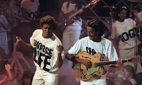
This is the type of fashion that I like because it is vintage & it is positive. The shirts are making a bold statement & are one of the first things that you will look at on this photo because of the boldness of the theme they are styled around. George Michael's hair is just simply amazing & I aspire to have it.
I like this fashion because it is using ideas for a winter fashion, also mixing ideas for a summer fashion with it. I also love the red hair that this model has. The whole colour scheme works well I personally believe.
I really like this model because she is combining many styles & eras together. The colour scheme also works very well in my opinion. While I absoutely love the red & white cardigan. I also really like the tone of this girls hair.

I like this models fashion because he is wearing a really nice woolen jumper. I also like the combination of jeans & shoes as they mix really well to make a good winter look. I also like the sunglasses as they create a contrast & I like contrast.

Although this is a football shirt from the 1960's I like it because it is vintage & it has a nice colour scheme to it. If it was added with some skinny jeans then it would look really good.

I really like this fashion sense, it is probably my favourite because it is retro & it is bright. I like the general colour scheme of the trousers used on all of these people. I also like the different shirts used here because it creates a nice summer feel while also contrasting different personalities in this picture. I like all of the shoes used in this picture because they work well with the denim trousers.

I really like Big Sean's fashion sense because it is based all around vintage denim. However it also combines a modern hip-hop look into it which I like. I especially like the denim jacket & the gold chain. This is because they work very well together as they create a vintage feel to the photo.
Friday, 13 January 2012
My Favourite Artists
Amy Winehouse



Amy Winehouse is my favourite artist of all time because I think that her voice along with her style was different from anybody else's. I also loved her because of her cutting edge lifestyle & I think she is a good person to idolise because of her mistakes. Therefore I won't touch drugs because of how it all ended for her.
This is my favourite song by Amy Winehouse. It is called 'Love Is A Losing Game'.
Nirvana

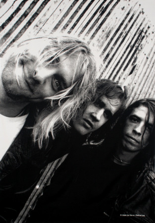
I love Nirvana because of the impact that they created on music, especially Kurt Cobain. I think that their style was original as it wasn't manufactured to be anything. It was just 3 guys who wrote music. I also love Nirvana's lyrics because of the deep but sometimes random topics that Kurt Cobain would write about.
This is one of my favourite Nirvana songs 'About A Girl'.
Wham!

Wham are my favourite duo of all time. This is because they are just so fun to listen to & their music makes me feel happy when I listen to it. I love their fashion sense as I love vintage/retro fashion. This is my favourite type of fashion to look at.
This is my favourite Wham! song of all time. It is just quite simply amazing. It is called 'Wham! Rap (Enjoy What You Do)'.
Birdy

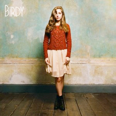
I love Birdy because of how well she plays the piano. This is because I love the piano so I love to learn her songs on it. I also love how her debut album was full of covers yet she still turned it into her own music. I think her fashion sense is good too because she likes knitted cardigans.
My favourite Birdy song 'People Help The People'. The piano introduction is inspiring.
The Vaccines

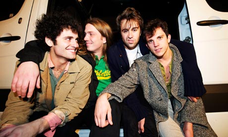
I love The Vaccines because they are an easy band to listen to. Their album 'What Do You Expect From The Vaccines?' is absolutely brilliant.
This is one of my favourite songs by The Vaccines. It is called 'Family Friend'.
There are many other artists that I like such as:
- Avril Lavigne
- Arctic Monkeys
- Otis Redding
- Dionne Bromfield
- Joe Purdy
- The Beatles
- Ben Howard
- Bob Marley
- Foo Fighters
- Two Door Cinema Cub
Inspirational Magazine Covers
This magazine cover is good because it has an appealing celebrity (Mila Kunis) on the front while also having a good colour scheme that is bold & catches the eye because of the yellow masthead with the bold, white subtitles.


I like this magazine cover because it has one of my favourite artists, Amy Winehouse on it. The magazine also has a simple but effective layout to it which I like.
I like this magazine cover because it is appealing to the eye, I like how the magazine cover features three artists with different styles of music, Jessie J being the main attraction as she is a woman. I personally like this magazine cover because of Arcade Fire. The 'Q Magazine' logo is also an appealing logo.
I like this magazine cover because the colour scheme is bold. I also like the theme of the magazine because it is different to the 'typical' magazine design. The picture of The Foo Fighters is also appealing to me because they are a band that I like. The fact that the featured interview with Dave Grohl is about his time in Nirvana also makes me like this cover.
I like this magazine cover because the writing is small, but is easy to read with the masthead being clear & bold as it is a different colour from the rest of the cover. The picture of Kurt Cobain is a good picture & also reminds me of the famous album cover for the album 'Nevermind'.

This magazine cover is good because it has an original font that creates a vintage feel to the cover. The magazine also has a washed out colour scheme which I like because this is my favourite colour scheme. I like the picture of Chris Martin too.

I like this magazine cover because it is alternative to other magazine covers. It uses a good colour scheme & I like how the picture of The Vaccines is in greyscale. The pink masthead & general font is good because it makes it stand out from other magazines.

I like this magazine cover because it has a neutral colour scheme that doesn't stand out too much while also appealing to the male market because it has Katy Perry in her underwear & bra. I like the fonts used in the 'Rolling Stone' magazine because the whole magazine has a vintage feel to it while using modern articles with huge personalities in the music industry.

I really like this magazine cover because it is retro & uses a very basic layout trying to expose George Michael's face. I like the fact that the picture is the main focus point on this cover.
Subscribe to:
Comments (Atom)


