Friday 30 March 2012

Draft Evaluation

Question 1
In what way does your media product use, develop or challenge forms and conventions of real media?


During the research & planning stages, we looked at various types of magazines produced from over the years along with magazines produced by students that had succeeded in this work in years before. We came to the conclusion that for the style of magazine that I would be producing it would be appropriate for me to challenge current conventions; this was further enhanced by the fact that the magazine actually stuck to a conventional layout though.
I considered the conventions used in the magazines that I had looked at & I decided that I wanted to base my 
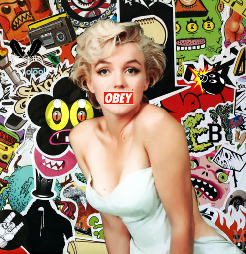
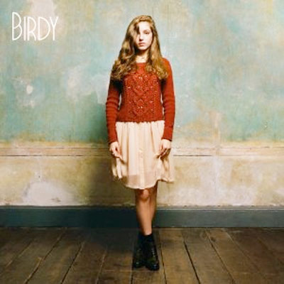
cover upon the Grace Jones album cover for ‘Portfolio’ because it looked quite alternative however also stuck to some conventions. I stuck to the idea of having the masthead at the top of the magazine for example, this is because all successful magazines will use this style of cover because it works best at catching the readers eye. I also stuck to the convention of a regular looking contents page (other than the colour scheme & the pictures) which further shows how I have actually both develop & challenge forms.
My masthead is fairly conventional, this is because it is placed in the centre at the top of the page; although it isn’t an overly conventional font. This is used because it is in the style of the Grace Jones album cover for ‘Portfolio’, therefore looking quite artistic. I placed the masthead over my feature artists head & the corner of the barcode because it also makes it look more vintage. I didn’t want it to look like it was obviously created on the computer. Therefore this makes it look more like it has been manually created.
The word ‘color’ in this cover page is a major selling point. This is because I have actually based this upon an iconic 1980’s television that was used in the USA. This is why ‘color’ is spelt in the American way instead of the British. This is telling the reader that this magazine is all over the world, not just in the UK.
The colour scheme used in this is obviously unconventional but this is used because it will appeal to the certain audience that it is targeted at.
The graphology of the magazine pages was a massive focus for me. I tried to make all of the pages of equal size and proportion. This then meant that it looked much more professional than my draft which had been extremely inconsistent. I tried to base my contents page upon old contents pages from the former music magazine ‘Smash Hits’, especially the ones that were created in the 1980’s. As you can on the right hand side, I tried to bring the vintage colour scheme into the magazine without making it looking too colourful or too vibrant. I think I succeeded in this because of the contrasting dark colours in response to the bright vibrant ones. The page numbers had to be clear so I also used a dark colour to equal out the colour scheme so that it didn’t look too much.
The photographs used in this magazine made a big difference to the final product. In my draft magazine I didn’t really know what kind of model I would use for my pictures, however after researching more I found a certain style that fitted in with modern conventions. The pictures I took of my models were actually no less vintage than pictures taken for magazines focusing on other genres, however what I did was edit the pictures to make them look more arty & vintage looking. For example, my double page spread picture was actually based upon the Mika album cover ‘The Boy Who Knew Too Much’. I think that Mika is a good current artist who has a vintage style about him. For the pictures I usually tried to create a dark feeling about them because it again contrasted the vibrant colours involved with the rest of the magazine. The idea of this was unconventional because I again based a picture on an album cover from a particular artist instead of basing my pictures on pictures from other magazines; it was also art though, not just a photo that I tried to recreate.


Question 2
How does your media product represent particular social groups?

My magazine represents a small proportion of today's teenage society. The are the people that respect old music while dislike most modern 'pop' songs. They like fashion and like going onto the internet.
I don't think there is a particular group to place this target audience into, although the stereotype of a 'young alt' is a close representation.
My magazine used an alternative approach by trying to attract readers by using artistic ideas instead of the basic magazine layout. The use of colours in my magazine is also going against conventions.
The shot I used on my cover page is a close up, this is probably more appealing to artistic people, it is also aimed towards the male audience more.
My contents page uses both modern ideas and vintage ideas, the layout her shows this. The language is quite formal however it is used in an informal manner. The colours used on the contents page are actually quite 'girly' which makes this magazine extremely alternative to other magazines for male teenagers.
The double page spread is representing the readers as youthful and quite vibrant. This is shown by using the picture that I have on this spread. The colour scheme is both conventional and unconventional.

Question 3
What kind of media institution might distribute your media product and why?

The kind of media institution that I think would be an ideal distributer for my magazine is EMAP. This is the company that produced the 'Smash Hits' magazine from 1978 to 2006. The 'Smash Hits' magazine was actually a magazine that inspired me to create the layouts of my magazine therefore I can conclude that it is going to be very similar to my production. I think that the corporation would be a good producer for the magazine as well because they haven't got a music magazine being produced by themselves at this current date, but they obviously have experience in this market at creating an original magazine that attracts an audience. The fact that they don't have a music magazine being produced currently could also mean that they could make this magazine a priority, therefore meaning that it would probably have more effort put into it.

I could use several ways to distribute my magazine to the public, this could include posting issues to readers if they subscribe, the magazine could be sold in retailers (newsagents, supermarkets etc.) as well as certain articles being posted online (while the whole magazine can be downloaded for a price off of the internet) with advertisments making a profit instead of the income from the magazine. The use of internet could be a key area to publish my magazine as the target market for my magazine uses the internet throughout their daily lives.

I would use a method of paid circulation to sell the magazine instead of the free and controlled circulation. I think that the paid circulation would be appropriate because most music magazines will have paid circulation instead of the other two, this is so that the magazine will fit in with other music magazines and it will appeal to the target audience because the magazine will be available to a select group because of the set price instead of the free price that it would be if I chose free circulation. Controlled circulation wouldn't be ideal as it would be unapealling because of the 'qualification' issues with it, the younger generation wouldn't like this idea.

The magazine that I created would be published with a fixed price by EMAP weekly, however readers subscribing to the magazine would get a set discount off of the original price.


Question 4
Who Would Be The Audience For Your Media Product?

Profile Picture
This is Sam, he is a typical 16 year old boy that likes to listen to music and have a good time. He is in his first year of A Levels, he does AS Media, AS English Literature, AS English Language & AS Psychology. He loves listening to music and regulary listens to music on Gem 106 and he loves to search through his parents old music archives from the 20th century, especially the 1980's records.

He loves to go to concerts whenever he can, he likes to go to all types of concerts & festivals such as The Rewind Festival that is based all around celebrating music from the 1980's. The Rewind Festival 2011 lineup included famous artists from the 1980's that included Holly Johnson (Frankie Goes To Hollywood), Billy Ocean, Bananarama & Village People. This year he plans to go to the 2012 Rewind Festival & other concerts involving current artists that he likes such as Lana Del Rey, Jessie J, Coldplay & George Michael.

He is looking forward to seeing George Michael live in concert as he is from the 1980's however he is still a current artist making new music. He has been listening to them since he was a young child because of his mother playing his solo & Wham! CD's in the car.

He carries an iPod with him at all times because he relies on music to calm him down when he is angry or make him happy when he is sad. He has many songs on his iPod however he can't actually fit all of his iTunes library on it. He has a total of 17,678 songs on his iTunes library, most of these songs are from the 20th century.

In his spare time he does his homework, goes out with friends & uses the internet a lot. He loves using websites like Tumblr because he loves fashions created on there. This is because there are many users who like to base their fashions on the 1980's on Tumblr. He also loves shopping at shops like Topman, River Island & Urban Outfitters. He likes to buy clothes online though because there is more variety for his fashion sense.

Sam doesn't have a job, but his parents give him pocket money of £10 a week if he does jobs for them. With this he buys magazines such as Q Magazine, however he doesn't like the fact that there isn't a magazine celebrating the 1980's weekly on his newsagents shelves.

Sam is definitely a good character to describe as my target audience. He likes to read about new artists that have carried on the 80's style & he likes to read about music in general while looking at the latest 'gossip'. I think that he would like the articles included, showing articles that would appeal to him including reviews & competitions.

Question 5
How did you attract or address your audience?


My target audience consisted of the older teenager to the young adult, this is obviously an age where education is valued because education is no longer compulsory. Therefore I have tried to make the magazine look both basic and simple, but also a good enough quality to make it look good enough for the audience to read it. I am also trying to attract more men into this magazine; I addressed this by using a young male on the magazine cover but I just used his head without his body. This made it look like a piece of art and just took the basics of human life, which a man likes more than a woman. The colours used around my magazine are stereotypically recognised as quite feminine colours, however these colours are used to attract the audience because of the era that the magazine is celebrating. The 1980's was full of colours so that is what I have tried to recreate here. The magazine cover is extremely plain and just features the feature artist along with the title of the article etc. This again explores the idea that this magazine is like a piece of artwork (just like the Grace Jones album cover for 'Portfolio' on which this is based), this creates a non-conventional magazine cover that will appeal to my audience because of how they generally like to be different. I have used artists based all around the world as well, this therefore makes the reader think that this magazine is of high class; not small time like some magazines are. The word 'color' on the magazine cover is also aimed at targeting the audience as this is all based upon an iconic 1980's TV sign; this is also why the word is spelt in American fashion instead of British, this should appeal to the target audience because it is using iconic things to remind us of the actual 1980's while also looking modern and unique.


The contents page again explores many conventions, especially with my target audience being male. The pink is making it bright and vibrant like many of the 80's pop were, the white background that the headings are on are actually based around the idea of paintbrush strokes. This would appeal to the audience because it is again exploring the use of art throughout the magazine. I think that the pictures used on this contents page would be successful in making the magazine appealing because they are incorporating modern fashions with 1980's fashion. The pictures are also showing young, upcoming artists which will also appeal to the reader while also sticking to the era that the magazine is based around. I think that the idea of placing subheadings on this page also helps appeal to the reader because it is organised and makes it simpler to navigate throughout the magazine.


The language that I have used throughout the double page spread is appealing to the reader because it is formal; using proper English throughout, however it is used in an informal manner. Therefore making the reader feel more involved in the interview itself. I also think that the photo used on the double page spread is extremely effective in appealing to the target audience. This is because it is both bright and incorporates art throughout. It has combined modern art and fashions with the 1980's style, this should appeal to the audience because of it fitting in with a set convention but also being alternative. The use of the same font for all of the headings for this article again exposes the importance of the whole article, not just part of it. It is bold along with being colourful, using vintage colour schemes. The whole idea of the stars and space tries to expose the fact that the feature artist is bigger than human, as in being 'out of this world', again incorporating the personality of many 1980's superstars.

Overall, I think that I have done many things to make my magazine attract my target audience. I think I have succeeded in this because I have used the right type of colour scheme while also using a conventional layout for a modern magazine. Therefore making the experience for the reader enjoyable, although many of of my friends have admitted that they aren't attracted to this type of music they have told me that if they were then they would consider buying the magazine. This proves to me that I have succeeded in making this magazine look good enough to be classed as a good quality magazine.

Question 6
What have you learnt about technologies from the process of constructing this product?
  • Computers (Dell Studio One 19 and School PC)
  • Photoshop
  • Canon SX30 IS
  • Microsoft Word 2010
  • Scribd
  • Animoto
  • The Internet (Google Chrome & Internet Explorer)
Question 7
Looking back at your preliminary task, what do you feel you have learnt in the progression from it to the full product?
I personally think that my biggest progression from my preliminary task is my ability to understand how to incorporate the basic conventions of a magazine into the software that I am using; in this case Photoshop. I think that my knowledge of Photoshop has improved even though I had basic knowledge of it before hand, I have a better idea of which tool will now work better in some cases while I also now know that sometimes editing things too much doesn’t work. I feel that I learnt a lot from my draft magazine because I picked a hard genre of music to base my magazine upon but I succeeded in producing it. I feel that my preliminary task has no comparison at all to my final version of the magazine that I have produced here. I have slowly improved at getting my work done, while I have improved at meeting deadlines.

My understanding of magazines has improved drastically; I have learnt what will work in magazines and what won’t because of the mistakes that I have made before. I think the improvement on both the magazine covers and the contents pages are immense which shows how much I have simply improved. I have learnt how to make a picture look much better now as well, whereas before I thought that altering the contrast of a picture will make it look better without anything else being done to it.
The biggest difference between the cover pages is that the final one is looking like a good quality magazine cover that is showing artistic qualities; the preliminary task obviously shows that it has been put together with little knowledge about the media industry. The differences in the contents pages also expose how much I have improved, the preliminary page looks overly edited while the final version looks like a good quality page that could be inserted into a magazine that is focusing on the 1980’s.

To The Examiner

Thank you for taking your time to look through my blog at my work. I feel like I have improved a lot throughout this work & I hope that you have seen how much I have progressed too.

Thursday 29 March 2012

Evaluation- Question 7

Evaluation- Question 7

Evaluation- Question 6

Evaluation- Question 5

How did you attract or address your audience?


My target audience consisted of the older teenager to the young adult, this is obviously an age where education is valued because education is no longer compulsory. Therefore I have tried to make the magazine look both basic and simple, but also a good enough quality to make it look good enough for the audience to read it. I am also trying to attract more men into this magazine; I addressed this by using a young male on the magazine cover but I just used his head without his body. This made it look like a piece of art and just took the basics of human life, which a man likes more than a woman. The colours used around my magazine are stereotypically recognised as quite feminine colours, however these colours are used to attract the audience because of the era that the magazine is celebrating. The 1980's was full of colours so that is what I have tried to recreate here. The magazine cover is extremely plain and just features the feature artist along with the title of the article etc. This again explores the idea that this magazine is like a piece of artwork (just like the Grace Jones album cover for 'Portfolio' on which this is based), this creates a non-conventional magazine cover that will appeal to my audience because of how they generally like to be different. I have used artists based all around the world as well, this therefore makes the reader think that this magazine is of high class; not small time like some magazines are. The word 'color' on the magazine cover is also aimed at targeting the audience as this is all based upon an iconic 1980's TV sign; this is also why the word is spelt in American fashion instead of British, this should appeal to the target audience because it is using iconic things to remind us of the actual 1980's while also looking modern and unique.

The contents page again explores many conventions, especially with my target audience being male. The pink is making it bright and vibrant like many of the 80's pop were, the white background that the headings are on are actually based around the idea of paintbrush strokes. This would appeal to the audience because it is again exploring the use of art throughout the magazine. I think that the pictures used on this contents page would be successful in making the magazine appealing because they are incorporating modern fashions with 1980's fashion. The pictures are also showing young, upcoming artists which will also appeal to the reader while also sticking to the era that the magazine is based around. I think that the idea of placing subheadings on this page also helps appeal to the reader because it is organised and makes it simpler to navigate throughout the magazine.


The language that I have used throughout the double page spread is appealing to the reader because it is formal; using proper English throughout, however it is used in an informal manner. Therefore making the reader feel more involved in the interview itself. I also think that the photo used on the double page spread is extremely effective in appealing to the target audience. This is because it is both bright and incorporates art throughout. It has combined modern art and fashions with the 1980's style, this should appeal to the audience because of it fitting in with a set convention but also being alternative. The use of the same font for all of the headings for this article again exposes the importance of the whole article, not just part of it. It is bold along with being colourful, using vintage colour schemes. The whole idea of the stars and space tries to expose the fact that the feature artist is bigger than human, as in being 'out of this world', again incorporating the personality of many 1980's superstars.

Overall, I think that I have done many things to make my magazine attract my target audience. I think I have succeeded in this because I have used the right type of colour scheme while also using a conventional layout for a modern magazine. Therefore making the experience for the reader enjoyable, although many of of my friends have admitted that they aren't attracted to this type of music they have told me that if they were then they would consider buying the magazine. This proves to me that I have succeeded in making this magazine look good enough to be classed as a good quality magazine.

Evaluation- Question 4


Evaluation - Question 3

What kind of media institution might distribute your media product and why?

The kind of media institution that I think would be an ideal distributer for my magazine is EMAP. This is the company that produced the 'Smash Hits' magazine from 1978 to 2006. The 'Smash Hits' magazine was actually a magazine that inspired me to create the layouts of my magazine therefore I can conclude that it is going to be very similar to my production. I think that the corporation would be a good producer for the magazine as well because they haven't got a music magazine being produced by themselves at this current date, but they obviously have experience in this market at creating an original magazine that attracts an audience. The fact that they don't have a music magazine being produced currently could also mean that they could make this magazine a priority, therefore meaning that it would probably have more effort put into it.

I could use several ways to distribute my magazine to the public, this could include posting issues to readers if they subscribe, the magazine could be sold in retailers (newsagents, supermarkets etc.) as well as certain articles being posted online (while the whole magazine can be downloaded for a price off of the internet) with advertisments making a profit instead of the income from the magazine. The use of internet could be a key area to publish my magazine as the target market for my magazine uses the internet throughout their daily lives.

I would use a method of paid circulation to sell the magazine instead of the free and controlled circulation. I think that the paid circulation would be appropriate because most music magazines will have paid circulation instead of the other two, this is so that the magazine will fit in with other music magazines and it will appeal to the target audience because the magazine will be available to a select group because of the set price instead of the free price that it would be if I chose free circulation. Controlled circulation wouldn't be ideal as it would be unapealling because of the 'qualification' issues with it, the younger generation wouldn't like this idea.

The magazine that I created would be published with a fixed price by EMAP weekly, however readers subscribing to the magazine would get a set discount off of the original price.

Evaluation- Question 2

Evaluation- Question 1

Wednesday 22 February 2012

My Feedback For The Draft

Luke
  • All mid-shots, no veriety.
  • Random pictures.
  • Good register & language.
  • Inconsistent colour scheme.
Sammy
  • Put into columns?
  • Good colour scheme.
  • All mid-shots.
  • Well structured.
  • Vary it a bit more.
Mae
  • Pictures that relate to music.
  • Wider range of shots.
  • Double page spread should look a bit better? Block?
  • Good colour scheme for cover.

I Would Like My Final Magazine Cover To Be Based About This:


Sunday 19 February 2012

In what ways does your media product use, develop or challenge forms & conventions of real media products?
I used a non-conventional layout & colour scheme for my design. This consisted of a blue, yellow & purple which isn't widely used in the media industry. I did generally base my magazine on the Z & F models though, while basing it all around what magazines used to really look like in the 80's.
How does your media product represent particular social groups?
My magazine focuses on people with a 'vintage' fashion & music sense. The magazine represents men & women as equal & the same as each other while making the human race look happier than it really is.
What kind of media institution might distribute your media product & why?
I don't really know any media institutions that would distribute a magazine similar to mine. This is because it is based on what vintage magazines looked like & now magazine layouts & styles have generally moved on.
Who would be the audience for your media product?
The audience for my magazine is probably more aimed towards men than women, however it should appeal to both really because of the kind of articles that are in it. The fashion/styles in the magazine mean that it would be directed towards people with a vintage style.
How did you attract/address your audience?
I used extremely bold colours that would be eye appealing to the audience, while also using an extremely bold font that also creates a bold feeling.
What have you learnt about technologies from the process of constructing this product?
I have learnt that you have to be careful in how you create the magazine & that you have to think hard with regards to the layout of it. I have also learnt how to create a magazine cover, contents page & article on Photoshop.
Looking back at your preliminary take, what do you feel you have learnt in the progression from it to the full product?
I have learnt how to create on decent looking cover on Photoshop whereas before, I didn't make things look as professional. I learnt out certain styles can also fail dismally while unlikely styles can work well.

Sunday 5 February 2012

Feature Article Draft- Hector Drew

Hector Drew Interview

Wednesday 1 February 2012

Feature Character Profile

Name: Hector Drew
Place Of Birth: Camden, London
Date Of Birth: 16/6/1994
Inspirations:
  • George Michael
  • Amy Winehouse
  • Kurt Cobain
  • Etta James
  • Boy George
  • Madonna


George Michael, one of my characters inspirations.


Instruments Played: Piano, Guitar, Banjo & Ukulele.
Personal Life: Hector was born to a middle class family in Camden. He learnt how to play the piano from a young age & showed a genuine interest in music from when he first started. His mother & father split up when he was at the age of 9, this then meant that his father paid for guitar lessons. This meant that he was then learning both the piano & the guitar from a relatively young age.
Achievements: Hector was part of the successful teenage pop duo 'Shimmer', although they only made 2 albums the second that was released became the best selling album of 2006 while being critically acclaimed. This then meant that when the duo split up many record labels were interested in Hector becoming a single artist. So far, he has released 1 successful album that has gone to number 1 in the UK album charts. His first album 'Happy Days' was nominated for many awards throughout 2009 & his follow-up EP 'Cage' is going to be released later on in 2012.
Style: Hector is known for his eccentric 1980's fashion sense. Very much in the style of Wham! (George Michael & Andrew Ridgely). This means that he wears many print shirts, denim jeans & jackets, Reebok Classics & many other iconic clothing styles from the 1980's.
Audience: Hector has appealed to a wide audience. He has appealed to many teenagers as he is around the same age & he has appealed to an older audience because of his vintage style of pop music.

Sunday 29 January 2012

Clean Cut Image

I have now decided that I want a clean cut theme. With my model seducing the audience in an alternative manner, instead of wearing seductive clothes.

Thursday 26 January 2012

A Change In Idea Of What I May Call My Magazine

I may now call my magazine 'PopStream', this is because I thought of iconic products that defined the 1980's as this is what my magazine is based upon. I therefore got the idea of incorporating the idea of 'SodaStream' into the magazine. I then thought of the word 'pop' which defines the genre of music that I am loosely basing the magazine upon. I then combined them together to make the word 'PopStream'.

Equation
'Pop Music' + 'SodaStream' = 'PopStream'.

My Presentation After The Pitch

Sunday 22 January 2012

My Target Audience

My target audience will be people that love '80's' pop music. The magazine should appeal to both males & females as it will feature varied colours & it will use models of both sexes. The audience should be into 'mainstream' fashion from the 1980's. This consists of a lot of denim (especially jackets & jeans), along with knitted jumpers, sports trainers & outgoing hairstyles based on George Michael's hair. Therefore they will have to be interested in fashion. Although the magazine will be featured around the 80's it will also feature artists that are similar to that type of music now, therefore artists from the latest generation will also be included, meaning that this may appeal to others as well. The magazine will also have a hint of modern fashion in it as well, it will be 80's fashion combined with today's fashion.

Ideas For A Magazine Font

 I like this font because it gives off a stereotypical retro feel to it. It reminds me of album covers made by the record label 'Motown' for some reason, which is vintage.
 I like this font because it is bold & stands out well. It catches the audiences eye & also looks vintage, yet not too vintage therefore appealing to a wide audience.
I like this font because it is big & looks good. It isn't very bold, yet it is retro looking. Therefore fitting in with the theme of my magazine.

Ideas For A Magazine Name

As I will be wanting to produce a magazine targeting an audience that likes old music, in particular probably the 1980's. Therefore I have thought that 'Vintage', 'Time' or 'Record' are good ideas for a magazine name.

Saturday 21 January 2012

3 Inspiration Music Magazine Covers

Freddie Mercury/Queen Rolling Stone Magazine Cover
I

This magazine uses the basic colour scheme of red, white & black. This is a very good colour scheme because it is one of the most appealing colour schemes that you can produce for a magazine that somebody is using. The layout works because it is all featured around the picture of Freddie Mercury live, this is a good picture to use because he is simply an icon in the music industry. The picture of Mercury is made to draw the readers attention. I can justify this because it is in the centre of the cover while being a bold confident picture which makes you look at it. The fact that his head is also over the traditional 'Rolling Stone' magazine logo shows that he is the main focus of this magazine. The masthead is also red, this creates a very bold & bright cover for the reader to see as they pick up the magazine. The background is black & features nothing except for Freddie Mercury which again backs up the fact that he is the main focus of this magazine along with his band Queen. The general font used on this cover is good because it gives the magazine a vintage feel to it which fits in with Mercury's era, it is also bold therefore the reader will look at the less important articles as well as the feature article. On this cover, another article is featuring Madonna, this is fairly clear because of the bold writing. Finally, the dates below the 'Rolling Stone' logo are important because this informs the reader of what the article will be featuring on, therefore it attracts fans of both Freddie Mercury & Queen because of the way that the magazine is presented. I like the simple basis of this cover because it is comes across to the reader very well therefore I would consider making my magazine cover like this.
Paramore NME Magazine Cover
This album cover is simply featured all around the band Paramore, in particular the lead singer Hayley Williams. The photo of the band on this cover is made to look quite basic & the band aren't dressed in anything over the top. This makes the band & the magazine appeal to people that aren't trying to find bands for just the look, this is for people that want to experience a band that can produce 'proper' music. Hayley Williams is featured in the centre of the cover & in front of the other band members because it is quite rare to see women in rock bands like this, therefore creating a whole new appeal to the reader of the magazine. The colour scheme for this magazine is quite complicated. It uses black, white, pink, grey & red as the main colours, however the trademark Hayley Williams orange hair could be classed as a major colour too because it could draw a reader to the cover of the magazine. The pink heading is very eye catching & it could draw a reader in to see what it says, then the smaller white text around it works well because it just contrasts the pink. The font is basic & it is obvious that the cover is trying to make you look at Hayley Williams, nothing else. The white circle used to promote an article with Mumford & Sons is also effective because this means that the magazine will appeal to a wide audience because of the different styles of music advertised on this cover. The circle also works very well because it stands out from the grey background used behind it & the font used for advertising the article to the reader is bold, using a good colour scheme of red & black. I like the sub-headings in the bottom left corner, this is because they don't draw too much attention to themselves yet if the reader looks at the cover in detail they may see more artists featured in the magazine that they like. This again shows how broad the music range is in this magazine.
Bob Marley Billboard Magazine Cover
This magazine cover featuring Bob Marley is very good in my opinion. This is because the whole cover is based around the feature article 'Is The Ghost Of Marley The Next Blockbuster Brand?', the picture itself gives off a very ghostly, haunting vibe. Therefore showing that this article is going to be aimed at his legacy after his death. This will appeal to both his old fans & the younger generation that like to find out about new artists. The picture of Bob Marley is used as the whole background in this magazine & uses washed out colours in the photo, giving the haunting vibe to the reader. The shirt that Marley is wearing also appeals because this kind of shirt is back in fashion therefore appealing to readers that like looking at various artists fashion senses. The shirt is also fairly basic which shows us that Marley was a very laid back man along with his hairstyle, which indicates a stereotypical reggae artist. This would therefore make this magazine appeal to an audience that likes reggae music. The masthead for this cover is very bright & bold, this catches the eye of the reader. The font for the masthead is also good because although it contrasts Bob Marley's work, it also shows the reader that the magazine will probably feature other types of artist other than Bob Marley & his trademark reggae music. The headings on this magazine are placed around Marley's face which shows that they are less important than the feature article, however they may be advertising articles that appeal to a different audience. The cover uses a very basic colour scheme, the main colour used is white which is used for all of the fonts used while the picture consists of a orange & a blue. Therefore creating an alternative colour scheme to the usual cover.

Thursday 19 January 2012

Marilyn Monroe Picture

I really like this picture of Marilyn Monroe & I saw it on Tumblr. This is what I could possibly make my magazine look like, however I would like a more washed out feel to it.

Michael Kiwanuka's Album Cover


I really like this album cover because it has a washed out feel to it & I saw it earlier when I was playing it, this gave me some thoughts to what I could base my magazine cover on.

Wednesday 18 January 2012

Double-Page Spreads


I like this double page spread because it is using a basic colour scheme. The spread is also showing quite an aggressive attitude by using the set pose that Lily Allen is using. The layout seems to be dedicated to making you look at Lily Allen's picture because the shirt is the only bright colour on the page generally while the picture is also large therefore showing that the article is featured on Lily Allen & trying to appeal it to Lily Allen fans or people that may like her style. I like the heading because it is alternative & it is presented casually to the reader. This is casual because the font is made to look like it is cut out newspaper letters, this also gives the sense of an aggressive approach because criminals may often send letters using this kind of style because they don't want to use their handwriting. This is also a clever font to use for the heading because she is in the newspapers often for various reasons so using a font that looks like a newspaper works well for the irony used in this article. The clothing that Lily Allen is wearing gives off a calm approach because she looks like she is just dressed for a casual day & her facial expressions give a sense of kindness which maybe gives the reader an insight into the Lily Allen that they haven't seen or heard of before this article has been released.

I really like this double-page spread because it has a vintage & dirty feel to it while also looking modern & up to date with technology. I like the picture on this magazine because it has a washed out, old feel to it that makes the band come across as being basic & here for the music, not for the fame in comparison for people like Lily Allen above. The Vaccines are wearing a fairly modern style of clothing, I think that this method works well as it contrasts the dirty, old feel to the magazine design. The heading on this spread suits the picture very well because it is very basic which gives it a simple, vintage feel therefore making the reader look at the picture to judge the bands looks. The bands photo looks serious which also brings us back to the subject of them being serious about their music & they aren't trying to make a major name in the media for themselves other than their musical ability. The photo also gives the reader a good insight into what the band will probably sound like if they haven't heard of the band before. They look like a stereotypical 'indie' band therefore maybe appealing to the audience that likes 'indie' music. The guitars also hint that they have a hint of rock in their musical influences therefore appealing to people that may like rock music as well. I like the hints of blue in the colour scheme as well because it gives it a slightly modern feel which reminds the reader that this is a new, up & coming band, maybe a good band to follow for the future. The blue lines on this magazine also match the blue quote in the text which creates a certain colour scheme. The lines also make the magazine look like it is damaged & old, therefore creating that dirty band feel again.
 
This double-page spread is good because it uses an alternative colour scheme of a faded purple, white & black. This works very well because it creates a bold & interesting layout for the reader. I really like how the purple fades from being a dark purple to a clear white as this makes the spread look vintage. The heading is also very appealing. This is because the font for it is made to look like it has been handwritten which makes the spread look vintage as it looks like it has been written before technology was widely used, this works very well because of the fact that Jimi Hendrix is a legend from years ago & so the fact that the heading is made to look old supports his legacy. I also really like the picture used on this double-page spread because it suits the whole washed out vintage feel to the article. The clothing that Hendrix is wearing is arguably a trademark that he created, his fashion & hair was a distinct feature so the fact that he is wearing his well known clothing makes the reader relate to him & his music easier. The layout of text that is good because it shows that the spread is dedicated attracting the reader to the picture & the heading, this is because the black text is small & basic. Therefore using a basic font for the article is a good thing to do.

Monday 16 January 2012

My Preferred Fashion


This is the type of fashion that I like because it is vintage & it is positive. The shirts are making a bold statement & are one of the first things that you will look at on this photo because of the boldness of the theme they are styled around. George Michael's hair is just simply amazing & I aspire to have it.

I like this fashion because it is using ideas for a winter fashion, also mixing ideas for a summer fashion with it. I also love the red hair that this model has. The whole colour scheme works well I personally believe.

I really like this model because she is combining many styles & eras together. The colour scheme also works very well in my opinion. While I absoutely love the red & white cardigan. I also really like the tone of this girls hair.
H&M, H&M, Asos
I like this models fashion because he is wearing a really nice woolen jumper. I also like the combination of jeans & shoes as they mix really well to make a good winter look. I also like the sunglasses as they create a contrast & I like contrast.

Although this is a football shirt from the 1960's I like it because it is vintage & it has a nice colour scheme to it. If it was added with some skinny jeans then it would look really good.

I really like this fashion sense, it is probably my favourite because it is retro & it is bright. I like the general colour scheme of the trousers used on all of these people. I also like the different shirts used here because it creates a nice summer feel while also contrasting different personalities in this picture. I like all of the shoes used in this picture because they work well with the denim trousers.

I really like Big Sean's fashion sense because it is based all around vintage denim. However it also combines a modern hip-hop look into it which I like. I especially like the denim jacket & the gold chain. This is because they work very well together as they create a vintage feel to the photo.

Plan

AS Media Foundation portfolio G321 Schedule 2012

Friday 13 January 2012

My Favourite Artists

Amy Winehouse
Amy Winehouse is my favourite artist of all time because I think that her voice along with her style was different from anybody else's. I also loved her because of her cutting edge lifestyle & I think she is a good person to idolise because of her mistakes. Therefore I won't touch drugs because of how it all ended for her.

This is my favourite song by Amy Winehouse. It is called 'Love Is A Losing Game'.


Nirvana
I love Nirvana because of the impact that they created on music, especially Kurt Cobain. I think that their style was original as it wasn't manufactured to be anything. It was just 3 guys who wrote music. I also love Nirvana's lyrics because of the deep but sometimes random topics that Kurt Cobain would write about.


This is one of my favourite Nirvana songs 'About A Girl'.


Wham!
Wham are my favourite duo of all time. This is because they are just so fun to listen to & their music makes me feel happy when I listen to it. I love their fashion sense as I love vintage/retro fashion. This is my favourite type of fashion to look at.


This is my favourite Wham! song of all time. It is just quite simply amazing. It is called 'Wham! Rap (Enjoy What You Do)'.


Birdy
I love Birdy because of how well she plays the piano. This is because I love the piano so I love to learn her songs on it. I also love how her debut album was full of covers yet she still turned it into her own music. I think her fashion sense is good too because she likes knitted cardigans.


My favourite Birdy song 'People Help The People'. The piano introduction is inspiring.


The Vaccines
I love The Vaccines because they are an easy band to listen to. Their album 'What Do You Expect From The Vaccines?' is absolutely brilliant.


This is one of my favourite songs by The Vaccines. It is called 'Family Friend'.


There are many other artists that I like such as:
  • Avril Lavigne
  • Arctic Monkeys
  • Otis Redding
  • Dionne Bromfield
  • Joe Purdy
  • The Beatles
  • Ben Howard
  • Bob Marley
  • Foo Fighters
  • Two Door Cinema Cub
I basically will listen to any music around.