
I like this double page spread because it is using a basic colour scheme. The spread is also showing quite an aggressive attitude by using the set pose that Lily Allen is using. The layout seems to be dedicated to making you look at Lily Allen's picture because the shirt is the only bright colour on the page generally while the picture is also large therefore showing that the article is featured on Lily Allen & trying to appeal it to Lily Allen fans or people that may like her style. I like the heading because it is alternative & it is presented casually to the reader. This is casual because the font is made to look like it is cut out newspaper letters, this also gives the sense of an aggressive approach because criminals may often send letters using this kind of style because they don't want to use their handwriting. This is also a clever font to use for the heading because she is in the newspapers often for various reasons so using a font that looks like a newspaper works well for the irony used in this article. The clothing that Lily Allen is wearing gives off a calm approach because she looks like she is just dressed for a casual day & her facial expressions give a sense of kindness which maybe gives the reader an insight into the Lily Allen that they haven't seen or heard of before this article has been released.
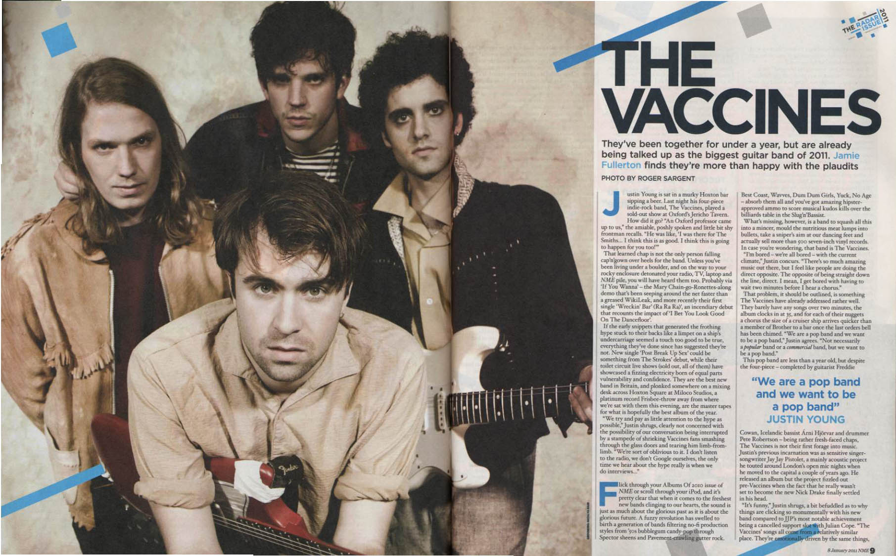
I really like this double-page spread because it has a vintage & dirty feel to it while also looking modern & up to date with technology. I like the picture on this magazine because it has a washed out, old feel to it that makes the band come across as being basic & here for the music, not for the fame in comparison for people like Lily Allen above. The Vaccines are wearing a fairly modern style of clothing, I think that this method works well as it contrasts the dirty, old feel to the magazine design. The heading on this spread suits the picture very well because it is very basic which gives it a simple, vintage feel therefore making the reader look at the picture to judge the bands looks. The bands photo looks serious which also brings us back to the subject of them being serious about their music & they aren't trying to make a major name in the media for themselves other than their musical ability. The photo also gives the reader a good insight into what the band will probably sound like if they haven't heard of the band before. They look like a stereotypical 'indie' band therefore maybe appealing to the audience that likes 'indie' music. The guitars also hint that they have a hint of rock in their musical influences therefore appealing to people that may like rock music as well. I like the hints of blue in the colour scheme as well because it gives it a slightly modern feel which reminds the reader that this is a new, up & coming band, maybe a good band to follow for the future. The blue lines on this magazine also match the blue quote in the text which creates a certain colour scheme. The lines also make the magazine look like it is damaged & old, therefore creating that dirty band feel again.

This double-page spread is good because it uses an alternative colour scheme of a faded purple, white & black. This works very well because it creates a bold & interesting layout for the reader. I really like how the purple fades from being a dark purple to a clear white as this makes the spread look vintage. The heading is also very appealing. This is because the font for it is made to look like it has been handwritten which makes the spread look vintage as it looks like it has been written before technology was widely used, this works very well because of the fact that Jimi Hendrix is a legend from years ago & so the fact that the heading is made to look old supports his legacy. I also really like the picture used on this double-page spread because it suits the whole washed out vintage feel to the article. The clothing that Hendrix is wearing is arguably a trademark that he created, his fashion & hair was a distinct feature so the fact that he is wearing his well known clothing makes the reader relate to him & his music easier. The layout of text that is good because it shows that the spread is dedicated attracting the reader to the picture & the heading, this is because the black text is small & basic. Therefore using a basic font for the article is a good thing to do.
No comments:
Post a Comment